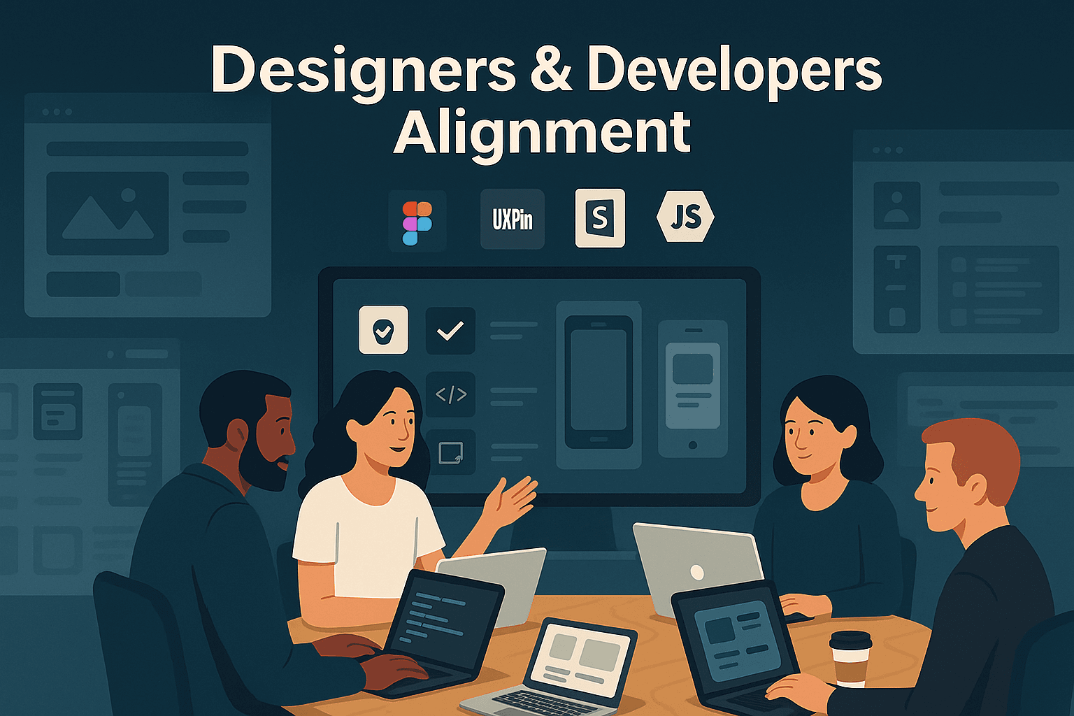
How to Align Designers and Developers on Standards
Jun 11, 2025
15 min read
How to Align Designers and Developers on Standards
Misalignment between designers and developers wastes up to 20 hours weekly per team and costs businesses millions. But when aligned, teams can cut development time by 50% and save millions annually. The key? Shared standards, unified design systems, and streamlined collaboration.
Here’s how to bridge the gap:
Build a shared design system: Create reusable components, consistent naming conventions, and centralized libraries to ensure design and development speak the same language.
Establish collaborative workflows: Use tools like Figma or UXPin to connect design and code directly, reducing handoff confusion.
Maintain alignment through testing: Use visual regression tools and regular audits to catch inconsistencies early.
Foster a culture of collaboration: Promote cross-team understanding, celebrate wins, and onboard new members with shared principles.
When teams align, they save time, reduce frustration, and deliver better products faster. Ready to transform your workflow? Let’s dive in.
Amazon’s Recipe for Design-to-Dev Harmony at Scale - 5-Minute Teaser 🎥
Building a Shared Design System
A shared design system acts as the bridge between a designer's vision and a developer's execution. When inconsistencies arise between design and development, workflows can grind to a halt. PayPal addressed this challenge by integrating UXPin Merge with Microsoft's Fluent design system. The result? They slashed prototype creation time from over an hour to just eight minutes by using live code components.
The benefits of design systems are clear. They improve efficiency by 34% and ensure consistency across projects. Carola Cassaro, Product Manager at Work&Co, highlights their transformative impact:
"Design systems have evolved to be more than just components and tools. They democratized design processes and best practices to empower product teams and businesses to ship great work at scale."
Creating a Common Language
The backbone of any successful design system lies in establishing shared terminology that unifies teams. Miscommunication, like designers calling something a "modal" while developers think "popup", can derail productivity. Eliminating this confusion starts with speaking the same language.
Begin by defining guiding principles that align with your product’s core values and user experience goals. For instance, if accessibility is a priority, emphasize inclusive design and standards like keyboard navigation.
Next, audit your current UI and code to identify what’s already in place. Catalog examples from existing products to pinpoint inconsistencies and decide which components need standardization first.
Consistency is key, so adopt clear naming conventions for components and variables. Instead of juggling terms like "primary", "main", and "default" for buttons, settle on one system everyone can follow. Extend this approach to interaction patterns, spacing, and even file structures.
Defining Core Components and Standards
Once you’ve established a common language, focus on defining your core UI elements. These components - buttons, forms, navigation elements - serve as the building blocks of your design system. Prioritize the most-used elements and design them to be reusable across projects. Each component should come with detailed documentation, covering its variations, usage, and technical specs.
Your documentation should also outline the foundations of your design system: accessibility standards, color palettes, typography, iconography, and spacing. These elements ensure visual harmony while giving developers the technical details they need to build accurately.
To streamline collaboration, map each design element directly to its corresponding code component. For instance, when a designer selects a button in Figma, the developer should immediately know which code to use. This reduces back-and-forth during handoffs.
Google’s Material Design, launched in 2014, is a great example of how a well-defined design language can scale across multiple products and platforms.
Finally, centralize your design libraries to ensure updates are automatically applied. This prevents outdated components from creeping into new projects.
Setting Up Governance for the Design System
Even the best design system can fall apart without proper governance. To keep it relevant and consistent, you need a plan. Start by identifying champions across teams who can promote the system and ensure its adoption. These advocates can spot issues early and act as liaisons between design and development.
Create a governance structure that defines who owns the system, who can make changes, and how updates are communicated.
The governance model can vary based on your organization. A centralized model ensures consistency with a dedicated team managing the system, though it may slow things down. Alternatively, a federated approach allows multiple teams to contribute under shared guidelines, offering flexibility but requiring stronger coordination.
Regular maintenance is essential. Schedule routine audits to check how components are being used and whether guidelines are being followed. Establish clear feedback channels and processes for proposing changes and implementing updates.
As UXPin puts it:
"The primary purpose of design systems is to increase efficiency in product development. With a consistent design language in place, it becomes easier to design products at scale that are consistent in aesthetics, user interface, and user experience. Design systems also promote collaboration, since handoffs across distributed teams become easier."
Setting Up Collaborative Processes
Once you've established a unified design system, the next step is to build collaborative workflows that keep designers and developers aligned throughout the project. A well-crafted design system is just the start - without effective collaboration, even the most organized system can lead to confusion rather than efficiency.
Connecting Design Tools with Development Environments
Bridging the gap between design tools and development environments has always been a challenge. Miscommunication often arises when designers and developers work in isolation. By directly linking these tools, you can eliminate guesswork and create a smoother handoff process.
Modern platforms like Figma have revolutionized team collaboration. For example, Figma’s Inspect panel allows developers to access precise design specifications without needing to interpret them manually. When a design library is set up correctly, the panel displays exact component names and styles being used, reducing ambiguity.
Instead of static PDFs or screenshots, share live, annotated design files that developers can explore in real time. This allows them to dive into UI details, measure spacing, and extract assets without constantly needing clarification from designers.
Organizing components with clear naming conventions and hierarchies is another game-changer. For instance, when both Figma and the codebase use the label "primary-large" for a button, developers know exactly which component to implement.
To avoid misunderstandings about animations or responsive behavior, document these details directly within the design files. For example, specify how a dropdown menu should animate or how layouts should adapt to mobile screens - leaving no room for guesswork.
Automation can take this integration further. Plugins that auto-generate responsive code snippets, export assets, or create style guides in developer-friendly formats can save time and effort. Tools like Chromatic, when paired with component libraries such as Storybook, can even compare deployed UIs with design artifacts to flag inconsistencies automatically.
This interconnected approach ensures smoother collaboration and sets the foundation for better teamwork.
Running Regular Cross-Team Reviews
Consistent reviews are key to maintaining alignment and refining the design system over time. These reviews serve different purposes: design reviews evaluate how well designs meet specific goals or requirements, while design critiques focus on gathering diverse feedback to improve designs.
Start each project with a kick-off meeting where both teams can align on goals and clarify any questions upfront. Follow this with milestone check-ins after key phases, such as user research, and schedule dedicated handoff meetings for design-to-development transitions.
To keep reviews productive, set clear objectives and limit attendees to those whose input is essential. Share context and design artifacts with participants ahead of time so they can prepare meaningful feedback.
Instead of asking for vague opinions, request specific input. For instance, rather than saying, "What do you think of this design?" ask, "Does this navigation pattern align with our current React components?" This ensures feedback is focused and actionable.
Both teams should understand the reasoning behind design choices and user flows. When developers grasp the "why" behind a design decision, they’re more likely to preserve its intent during implementation.
Creating and Maintaining Shared Documentation
Documentation acts as the glue between a design vision and its technical execution. It ensures consistency across UI components and supports a cohesive user experience.
From the start, assign clear responsibilities for creating, updating, and maintaining documentation. Use standardized templates and style conventions to keep everything organized. Documentation should serve as a single source of truth for developers, offering a clear roadmap for implementation while staying true to the original design.
As Erica Scolaro, Product Designer at Pennylane, puts it:
"High-quality design documentation is crucial for successful design implementation and collaboration. Well-done, regularly updated, and shared documentation establishes consistency in UI component implementation, ensuring a cohesive user experience."
Keep documentation concise and focused on what teams actually need. Agile documentation might include user stories, acceptance criteria, wireframes, technical specs, and release notes - avoiding exhaustive details that quickly become outdated.
Make updates a continuous process. For example, when Pennylane Design transitioned to color tokens in Figma in October 2024, they introduced a new palette system. This ensured designers could easily access and apply the correct colors throughout their workflow.
Visual elements like examples, illustrations, and screenshots can make documentation more digestible. These visuals help clarify both design intent and technical implementation.
Finally, encourage a culture where everyone contributes to keeping documentation accurate. Seek feedback from both designers and developers about what information is most helpful and how it should be presented. Collaboration tools, such as online project management platforms, can also help keep documentation up-to-date and accessible.
sbb-itb-2511131
Maintaining Consistency Through Testing and Validation
Even with strong collaboration between design and development, keeping everything aligned requires ongoing vigilance. Regular testing and validation act as a safeguard, ensuring that what gets developed matches the original design intentions. These efforts help catch inconsistencies early, preserving your design standards throughout the development process.
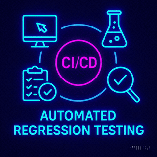
Using Visual Regression Testing Tools
Visual regression testing tools automate the process of spotting visual changes in your app's user interface after updates or code changes. Unlike functional tests, which focus on data outputs, these tools compare screenshots of web pages or UI components against saved "baseline" images to identify unintended changes. They’re excellent for detecting visual issues like misaligned elements, style inconsistencies, or font mismatches that might escape a human reviewer’s notice. Common problems include overlapping elements, missing components, or items not displaying correctly.
These seemingly small errors can have big consequences. For instance, one airline faced a costly issue when a terms and conditions overlay blocked the ticket purchase button - something visual regression testing could have flagged before release.
"Visual regression testing ensures that the appearance and layout of these elements remain consistent, bridging the gap between design and functionality." - Global App Testing
To maximize the value of visual regression testing, run tests frequently enough to catch major changes and update your baselines as needed. Focus on the most critical and high-risk pages, especially those with dynamic content. This automated process works hand-in-hand with broader system audits.
Running Regular Design System Audits
In addition to automated testing, manual audits play a critical role in ensuring that design standards are cohesive and up-to-date. A design system audit involves evaluating UI components, pattern libraries, and design guidelines to identify inconsistencies or gaps. These audits can be scheduled periodically or triggered by specific issues.
Start by setting clear, SMART goals for the audit - specific, measurable, achievable, relevant, and time-based. Evaluate your available resources, including time, budget, and team capacity. Then, gather all relevant design materials, such as UI elements, pattern libraries, and branding guidelines, into a central location. As part of the audit, categorize UI elements to spot duplicates or missing components, and assess accessibility features like color contrast and font choices.
Branding guidelines should also be reviewed to ensure that the design consistently reflects your brand identity. Once the audit is complete, create a clear roadmap for addressing issues and share your findings with stakeholders.
The impact of a thorough audit can be transformative. For example, in 2024, DOOR3 conducted a UX audit for Retrievr, a recycling startup. The audit uncovered usability issues and helped design a user interface that was simple yet effective for a diverse audience. By implementing a streamlined design system, they reduced their bounce rate by 50%.
"Design system audits are like having a health check on your digital product! We check the vitals for signs of concern or underlying issues, and recommend cures for any that we might find." - Tom Mcclean, DOOR3 design system audit expert
Setting Up Feedback Loops
Feedback loops are essential for keeping the lines of communication open between design and development. They allow team members to report issues, suggest improvements, and ensure continuous refinement of the design system. These loops not only enhance usability but also improve user satisfaction and reduce confusion.
To make feedback loops effective, set clear objectives and train team members to provide actionable, specific input. Use centralized proofing platforms to manage feedback in one place and ensure everyone is on the same page. Collect input through multiple channels to capture a wide range of user experiences.
"Feedback loops are a vital component of the UX design process. They allow designers to gather insights from users, identify pain points, and make improvements throughout the development cycle." - UXVerse
Analyze recurring issues from feedback, prioritize fixes based on their impact, and communicate updates to the team. Encourage open communication, and handle negative feedback promptly by investigating its root cause.
Shorter feedback loops are often more effective, as they enable faster iterations and help maintain alignment between design and development. Train both teams to see feedback as an opportunity for growth, ensuring the design system evolves as a dynamic tool that meets the team’s needs over time.
Building a Culture of Collaboration
Creating a strong culture of collaboration goes beyond having efficient design systems or streamlined processes. It’s about fostering mutual respect, understanding, and a commitment to learning together. When designers and developers truly understand each other’s roles, break down silos, and celebrate shared victories, real collaboration can thrive.
Promoting Cross-Team Understanding
Collaboration starts with empathy - understanding the challenges, limitations, and expertise each team brings to the table. Cross-training and shadowing sessions can help bridge the gap. For instance, teaching designers basic coding concepts or introducing developers to design principles can go a long way. When a designer works directly with a developer during implementation, they see how their design choices come to life in code. Conversely, developers gain valuable insight by participating in design critiques or observing user research.
Danielle Vertman, Product Designer, emphasizes this dynamic:
"I want to hear feedback from the developers and know that they feel comfortable expressing their opinion. I also want to understand how feasible my designs are as early as possible."
Empathy workshops are another effective tool, helping teams understand both technical and user experience constraints. These workshops, paired with regular knowledge-sharing sessions, encourage open dialogue and ensure both user needs and technical feasibility remain top priorities.
"Respect is the best currency which, when invested through empathy, creates a productive designer-developer collaboration."
– Radiant Digital
This mutual understanding not only strengthens teamwork but also creates a foundation for celebrating achievements and welcoming new team members.
Recognizing and Rewarding Team Successes
Celebrating joint accomplishments is a powerful way to reinforce the value of collaboration. Public recognition boosts morale and sets an example for others, while peer-to-peer recognition programs - where team members nominate colleagues who excel in cross-functional teamwork - can further strengthen this culture. Sharing success stories during team meetings or company updates highlights how collaboration leads to better outcomes.
Real-world examples show the impact of early cross-team efforts. In some cases, these collaborations have directly contributed to product launches that surpassed sales expectations. Dinesh Paliwal, former CEO of Harman International, puts it well:
"Collaboration is a key part of the success of any organization, executed through a clearly defined vision and mission and based on transparency and constant communication."
Recognizing these successes not only motivates current team members but also helps integrate new hires into the collaborative culture.
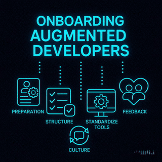
Onboarding New Team Members Properly
A well-structured onboarding process is essential for introducing new team members to the collaborative environment. Developers need to understand not just the technical tools but also the design principles that guide the team, while designers benefit from learning about development workflows and technical constraints. Pairing new hires with cross-functional buddies and assigning collaborative tasks early on helps them hit the ground running.
Cortex highlights the importance of this approach:
"A good onboarding process should give a new developer the tools they need for success and autonomy."
Simple initial tasks that require teamwork, combined with regular check-ins and ongoing opportunities for shadowing and cross-training, help new hires quickly adapt to the team’s collaborative workflow. This structured approach ensures that every new team member transitions from working independently to becoming an integral part of a cohesive, aligned team.
As Cortex further notes:
"Good onboarding helps developers to feel welcomed, supported and equipped to contribute effectively, making it necessary for a good developer experience (DevEx)."
– Cortex
Conclusion: Key Steps for Aligning Designers and Developers
Bringing designers and developers into alignment isn't just a nice-to-have - it’s a necessity. Misalignment comes at a steep cost, with key areas for improvement being design system adoption (68%), file organization (67%), and design documentation (66%).
To bridge the gap, focus on three core pillars: shared systems, collaborative processes, and a culture of partnership. Start by including developers in onboarding calls, information architecture discussions, and wireframe reviews. On the flip side, involve designers early in planning and review stages to sync workflows and avoid costly rework. This early collaboration ensures that technical realities shape design decisions right from the start.
Your design system is the glue that connects both teams. Tools like Figma or Zeplin can simplify handoffs, while regular retrospectives help fine-tune processes . As Pelin Kenez from Zeplin aptly states:
"Improving design delivery processes won't come from doing more of the same thing. We must go back to the basics of what makes a good process - structure and standardization."
Effective communication is the backbone of alignment. Adam Warner from Amazon highlights this challenge:
"There's a misunderstanding between the two sides where sometimes the flexibility that designers bring to the table really conflicts with the precision and the efficiency that developers need. But at the end of the day, we all want to ship a good product."
To foster this communication, create shared documentation, define clear "Definition of Done" criteria, and encourage cross-functional skill-building through knowledge-sharing sessions. Empower designers to test the products they create and provide feedback throughout development.
Criticism should be seen as a tool for growth. Build a culture of psychological safety where raising concerns leads to solutions, not blame. Joint OKRs that span both design and development responsibilities can further unify teams, promoting shared ownership of outcomes instead of siloed efforts.
The benefits of aligning designers and developers go far beyond better products. Teams become more satisfied, turnover decreases, and productivity thrives. Start by tackling your team’s biggest friction points and remember - small, consistent improvements can lead to big wins in the long run.
FAQs
What are the benefits of aligning designers and developers on shared standards, and how does this improve efficiency?
Aligning designers and developers around shared standards offers clear benefits that can elevate any project. It promotes smoother collaboration, ensures that design and implementation stay consistent, and cuts down on miscommunication. When teams work from the same playbook, they can produce better results more quickly, reduce unnecessary back-and-forth, and adjust more easily to changes or new iterations.
This kind of alignment can make a noticeable difference in a company's overall efficiency. Projects progress faster, onboarding becomes less complicated, and time-to-market improves - all of which drive productivity. Businesses that successfully integrate their design and development workflows often achieve stronger results, not just in terms of profitability, but also in their ability to innovate and respond to customer needs with greater agility.
How can teams keep their design system relevant and consistent over time?
To ensure a design system remains both useful and consistent, it's essential to establish clear roles and responsibilities. When everyone understands their part, collaboration becomes smoother. Having a dedicated team to oversee the system is key - this group handles updates, facilitates communication, and ensures alignment among designers, developers, and product managers.
Regular audits and detailed documentation are also vital. These practices help monitor how the system is being used, make onboarding new team members easier, and reinforce adherence to established standards. Incorporating version control and actively seeking feedback from stakeholders allows for ongoing refinement. Additionally, scheduling regular review sessions to discuss updates and progress ensures the design system evolves in step with your organization’s changing needs, keeping it practical and effective.
How can design and development teams work better together to follow shared standards?
To strengthen collaboration between design and development teams, start by setting up clear communication channels. Tools like Slack or Asana can help both teams stay on the same page regarding goals, updates, and priorities, reducing misunderstandings and keeping workflows smooth.
Organize regular cross-functional meetings or workshops to build mutual understanding. These sessions allow designers and developers to better grasp each other's processes, fostering respect and teamwork. Introducing design systems and shared documentation is another effective way to ensure everyone works from a consistent framework, minimizing errors and making the workflow more efficient.
Lastly, encourage basic knowledge sharing. When designers gain insight into development concepts and developers familiarize themselves with design principles, it bridges the gap between the two groups. This shared understanding can lead to a more cohesive and productive team.
Need an expert team to provide digital solutions for your business?


