Atomic Design in React: Build Scalable Component Libraries
Jun 6, 2025
11 min read
Atomic Design in React: Best Practices
Atomic Design is a method to organize React components into five levels: atoms, molecules, organisms, templates, and pages. It simplifies building reusable, scalable, and maintainable UI systems by breaking interfaces into smaller, manageable pieces.
Key Takeaways:
Atoms: Smallest components like buttons or input fields.
Molecules: Groups of atoms, e.g., a search bar (input + button).
Organisms: Larger UI sections, like a navigation header.
Atomic Design aligns perfectly with React's component-based architecture, making it a go-to strategy for building scalable apps. Start small, stay organized, and grow your system efficiently.
Atomic Design in React isn't without its challenges. While it's a helpful framework, it can sometimes slow down development or make component organization more complicated than necessary. Let’s break down some of the common issues developers encounter and how they can impact your workflow.
Difficulty Categorizing Components
One of the trickiest parts of Atomic Design is figuring out where a component fits - should it be an atom, molecule, or organism? This classification process can eat up valuable time and even lead to disagreements within the team.
The five-level structure of Atomic Design can feel restrictive. Developers often find themselves trying to force components into categories that don’t naturally fit their specific use case. For instance, a domain-specific component like a checkout progress indicator might not clearly belong to either molecules or organisms, leaving the team stuck in debates over its classification.
"Atomic design is not a linear process, but rather a mental model to help us think of our user interfaces as both a cohesive whole and a collection of parts at the same time."
Brad Frost
To avoid these debates, it’s a good idea to define each level of the hierarchy as a team before diving into development. Ask yourself: does breaking this feature into atomic levels add clarity, or is it just complicating the process?
Making Simple Components Too Complex
Another common problem is overcomplicating the simplest components - atoms. These are meant to be the building blocks, like buttons, input fields, or labels. But when developers add too much logic or too many props, the simplicity that makes these components reusable is lost.
Take a button atom as an example. If it’s designed to handle multiple states, themes, sizes, and behaviors all at once, it becomes harder to use and maintain. This kind of excessive abstraction often happens when developers try to anticipate every possible future use case. Instead, focus on keeping atoms simple and specific: a button should just handle basic button functionality, not complex styling or form validation.
Problems Managing State Across Components
As your design system grows, managing state can become a headache. A key challenge is deciding where state should live and how it should flow between components. Traditional state management methods, like useState or Redux, don’t always align neatly with the atomic structure.
One common issue is the blurring of stateful and stateless components. Should state logic be handled in organisms, templates, or globally? This lack of clarity can disrupt the flow of data in your app. Overusing tools like React Context can also cause trouble. While Context is great for global data (like user authentication), relying on it too much can lead to performance issues and unnecessary re-renders.
"Use atomic state management techniques to achieve better flexibility in organizing application state management."
Ijlal Windhi
A practical approach is to manage state at higher levels, like organisms or templates, and pass it down via props. This keeps atomic components clean and reusable while maintaining a clear data flow.
Scaling Issues in Large Design Systems
What works well for a small project can become overwhelming as your application grows. Scaling Atomic Design systems introduces its own set of challenges.
One major issue is component proliferation. Without careful oversight, teams can end up with multiple versions of similar components, like slightly different button variants, which could have been consolidated into one reusable component. This not only clutters the system but also makes maintenance harder.
Maintaining consistency across large teams is another challenge. When developers aren’t aware of existing components, they might create new ones unnecessarily, leading to fragmentation of the design system.
To avoid these problems, start by keeping components internal and reusing them in multiple scenarios before abstracting them into general-purpose components. Conduct regular audits to identify and consolidate similar components, ensuring your system stays organized and efficient.
Next, we’ll explore best practices to tackle these challenges head-on and streamline your Atomic Design process.
Best Practices for Atomic Design in React
Implementing Atomic Design in React can come with its challenges, but following some key strategies can simplify the process. These practices lay the groundwork for building scalable and maintainable React applications.
Create Clear Naming Rules
One of the biggest hurdles in Atomic Design is organizing components effectively. To tackle this, start by establishing clear naming conventions. A consistent naming system ensures everyone on the team knows how to structure and categorize components, saving time and avoiding confusion.
Set up a folder structure that mirrors the atomic hierarchy. For example:
/src/components/atoms
/src/components/molecules
/src/components/organisms
/src/components/templates
/src/components/pages
This setup makes it immediately obvious where each component belongs and what its function is. When naming individual components, consider using the ABEM (Atomic Block Element Modifier) convention. This method breaks CSS styles into smaller, manageable parts and clarifies the role of each component.
Document these conventions clearly and ensure that everyone on the team follows them. Consistency is the backbone of a successful design system.
Use Context API for State Management
Managing state across a component hierarchy can get tricky, especially as your application grows. The Context API simplifies this by allowing you to share data across components without the need for prop drilling. It uses a context provider to manage global state and a consumer to access it within components.
This approach works well for handling global states like user authentication, themes, or language preferences. Since its introduction in React 16.3, the Context API has become a go-to solution for avoiding tightly coupled components. To prevent unnecessary re-renders, consider creating separate contexts for unrelated states. Pair this with optimization techniques like React.memo, useCallback, and useMemo to ensure that only components with updated state or props re-render.
Storybook is a powerful tool for testing and developing atomic components in isolation. It allows you to focus on individual components, ensuring they work as expected before integrating them into the larger application.
By creating stories that showcase various states and configurations of each component, you can quickly test their behavior under different conditions. For example, when developing a Button component, you might create stories to demonstrate different sizes, colors, and interaction states. Organizing these stories by feature or functionality with clear, descriptive names makes it easier for the team to navigate and reuse components.
Storybook can also be extended with add-ons and integrated with testing tools like Jest or Cypress, keeping both your tests and documentation in sync as components evolve.
Improve Component Performance
As your design system scales, performance optimization becomes essential. Memoization is a key technique to minimize unnecessary re-renders. Use React.memo to wrap functional components that don’t need to update when their parent component re-renders. Similarly, useMemo can cache the results of expensive calculations, and useCallback prevents functions from being recreated on every render.
sbb-itb-2511131
Practical Examples of Atomic Design in React
The principles of Atomic Design become much clearer when you see them in action. By breaking down complex interfaces into smaller, reusable components, this method shines in real-world applications. Let’s dive into a couple of examples to see how this approach works.
Breaking Down an E-Commerce Header
An e-commerce header is a great example of Atomic Design at work. Start with the atoms - the smallest building blocks like the logo, search input, button, navigation link, and cart icon. Next, combine these atoms into molecules. For instance, a search bar might pair an input field with a button, or a navigation item might include a link alongside an icon. Finally, bring these molecules together with any remaining atoms to form an organism - in this case, the complete header. This modular setup makes your components more reusable and simplifies updates. For example, tweaking the button style automatically updates every place that button is used, saving time and effort.
Building a Dashboard Template
Dashboards are another excellent use case for Atomic Design, especially for managing complex layouts. Start with atoms like input fields, buttons, labels, and icons. Combine these into molecules, such as a search input paired with a filter button, a metric card that displays a number and a label, or a dropdown menu with a button and options. Then, scale up to organisms - for example, a sidebar that integrates navigation links with a user profile, or a chart area that combines filter controls with export buttons. Finally, use templates to define the overall structure of the dashboard, leaving specific data to be filled in later. This flexibility allows the same template to work across different scenarios, like analytics, user management, or sales pages.
The secret to success here is keeping each layer distinct. Atoms should remain simple, molecules should focus on combining related elements, and organisms should handle more complex interactions. By sticking to these boundaries, you ensure your codebase stays easy to maintain, test, and scale.
Summary and Next Steps
Atomic Design in React simplifies UI development by organizing interfaces into five distinct levels: atoms, molecules, organisms, templates, and pages. By maintaining clear boundaries between these levels and leveraging React’s component-based structure, developers can create reusable, scalable components.
Key Points for Developers
Organize components effectively: Use dedicated directories like /atoms, /molecules, and /organisms to keep your project structure clear and maintainable. If a component becomes too complex or repetitive, break it into smaller, more focused parts.
Focus on reusable APIs: Design components with decoupled, generic APIs. This approach ensures your components solve problems dynamically rather than being tied to static displays, making them adaptable to various use cases.
Leverage development tools: Tools like Storybook and the Context API can streamline development and testing. For instance, Storybook decorators allow you to mock React Context, enabling thorough component testing in isolation.
Simplify atoms: Keep atomic components straightforward and ensure that business logic is separated from the view layer. This separation makes them easier to test, debug, and reuse across your application.
By implementing these strategies - clear organization, reusable APIs, effective tool usage, and a focus on simplicity - you can create scalable React applications and design systems that are both efficient and maintainable.
Implementing Atomic Design principles effectively requires not just technical skills but also strategic execution. Propelius Technologies offers the expertise needed to bridge this gap. With over a decade of experience and a proven track record of delivering 100+ React.js projects in the SF Bay Area, we’re equipped to help you succeed.
Our Developer-for-Hire model embeds senior React engineers directly into your team. These developers, well-versed in Atomic Design, can assist with refactoring existing components or building new design systems from scratch. They integrate seamlessly, offering immediate expertise in React.js, state management, and component architecture - no onboarding required.
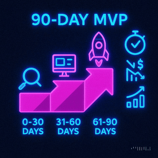
For those seeking a comprehensive solution, our Turnkey Delivery approach provides end-to-end development services at fixed pricing. From UI/UX design to component development, testing, and deployment, we handle it all. Plus, our 90-day MVP sprint comes with a shared-risk guarantee: if we miss deadlines, you could receive up to a 50% discount.
Whether you’re scaling an existing React application or starting fresh with a new design system, our highly skilled developers are ready to guide you through every step of the process. We prioritize delivering high-quality solutions that align with Atomic Design principles, ensuring flexibility and long-term maintainability.
FAQs
How does Atomic Design improve teamwork between developers and designers in React projects?
Atomic Design enhances teamwork in React projects by offering a clear framework for creating user interfaces. It organizes the UI into five distinct layers - atoms, molecules, organisms, templates, and pages - allowing developers and designers to share a common language. This shared understanding reduces confusion and keeps everyone on the same page.
The method emphasizes reusable components, enabling designers to maintain consistency while developers implement them effectively. This not only smooths the design-to-development process but also cuts down on miscommunication, helping teams produce cohesive, polished interfaces more quickly. Thanks to its focus on modularity, Atomic Design also simplifies project scalability, making updates and expansions more manageable over time.
How can I effectively organize components in React using the Atomic Design methodology?
To keep your React components well-organized using Atomic Design, divide them into five levels: Atoms, Molecules, Organisms, Templates, and Pages.
Atoms: These are your building blocks, like buttons, input fields, or labels - basic elements that can’t be broken down further.
Molecules: These are groups of atoms working together. Think of a search bar that combines an input field and a button.
Organisms: Larger components that mix multiple molecules and atoms, such as a navigation bar or a footer.
Templates: These define the structure of a page by arranging organisms into a layout.
Pages: Specific implementations of templates that include actual content, making them ready for users.
To make this system work smoothly, maintain a clear folder structure. Create separate directories for each level - atoms, molecules, organisms, templates, and pages. This keeps your codebase clean, boosts reusability, and makes scaling your application easier as it grows.
How can I avoid performance issues when using the Context API in an Atomic Design system?
When working with the Context API in an Atomic Design system, it's essential to manage performance thoughtfully. One effective approach is to divide contexts into smaller, purpose-specific units. Instead of using one large, all-encompassing context, create individual contexts for distinct pieces of state. This strategy ensures that only the components relying on a specific context are updated, reducing unnecessary re-renders.
Another key optimization is to wrap context values with useMemo. This prevents recalculations and helps minimize re-renders, particularly when the context value depends on complex computations or other states. Lastly, keep an eye on how often your state updates. Frequent updates can bog down your application, so managing their frequency is crucial.
By incorporating these techniques, you can build a streamlined and efficient system that aligns with Atomic Design principles.
Need an expert team to provide digital solutions for your business?


